


A trio of spaces are reimagined through unexpected and vibrant details
Prior to a mid-2010s whitewash, the walls of this main-level living space were painted a bright shade of red. But somewhere along the way, trends took hold, and off-white replaced the bold hue. After spending more time than ever at home during COVID, the homeowners called on McMillin Interiors design pro Dan Bergeron to restore the space to its former, colorful glory.
“The goal was to create something whimsical but elevated,” Bergeron explains. “We wanted to do something different, and the homeowners were open to new ideas.”
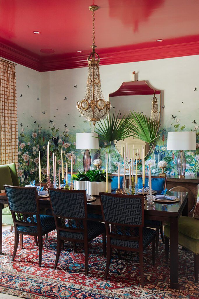
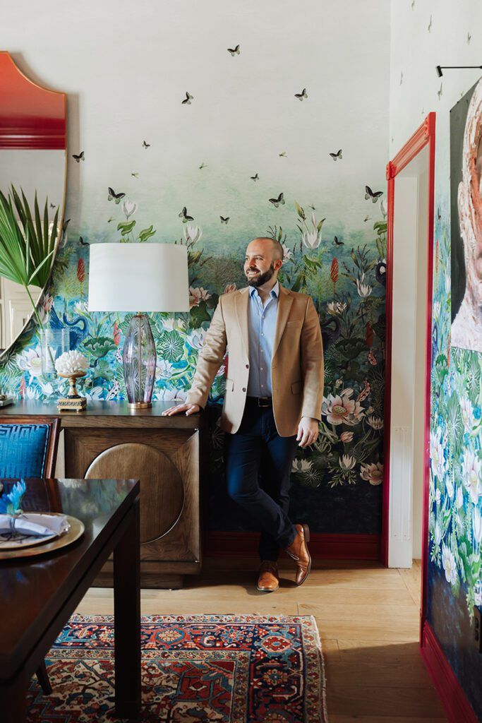
Bergeron’s first idea was the dining room mural. An Asian-inspired scene featuring koi fish, birds and plenty of butterflies, Bergeron says the Designer’s Guild wallpaper was a quick standout, corresponding well with the color palette of the homeowners’ cherished Persian Heriz rug that has adorned the dining room floor for decades.
“It was a no-brainer, honestly. We all immediately loved it,” he says. “From there, I always had a plan to paint the trim a bold color in the pink family, and that just evolved to doing the entire ceiling.”
Benjamin Moore’s “Magenta” was the chosen shade. But rather than a flat finish, Bergeron opted for a Fine Paints of Europe lacquer that was no small task to achieve.
“It took weeks of sanding and painting to get it perfect,” Bergeron recalls of the job completed by ASA Painters. “But it was worth it.”
With every new detail that was added to the dining room, from the avocado green host chairs to the Baccarat crystal chandelier, it became clear that the surrounding spaces needed a refresh. Since the foyer, living and dining rooms are open to one another, it didn’t make sense for one space to explode with color while the others stayed a forgettable off-white.
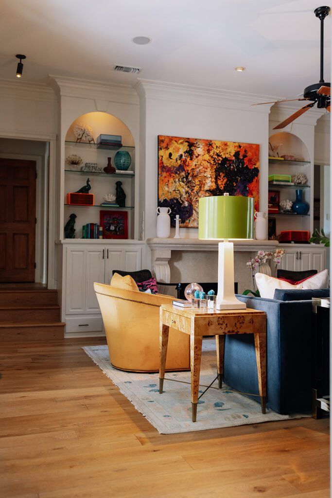
“The living room started with the idea of mango velvet chairs, pulling from the colors in the Harouni painting over the fireplace,” Bergeron explains. “From there, the space just evolved over a few months.”
A pair of pillows here. A trio of ginger jars there. Piece by piece, the collected and oh-so bright space slowly came together, with the finishing touches being a pair of green lampshades and two burl wood side tables that were added just days before these photos were taken.
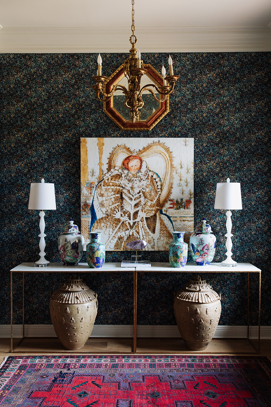
Alongside the living space, the adjacent foyer was also being reimagined. A dramatic, navy-based wallpaper was chosen for the small space, it’s rainbow details drawing on the variety of colors throughout the living and dining rooms. The real showstopper in that room, though, wasn’t a new addition, but rather a painting of Queen Elizabeth that has long been in the home, having been painted by one of the homeowners’ relatives in the 1990s.
“Working with clients that already have an expansive art collection, and a strong opinion on art, is so fun,” Bergeron says. “Art is so personal, and just because I love something, doesn’t mean someone else will.”
And with bright details like those that make these living spaces shine, the same is true. Mango velvet isn’t for everyone. But taking a chance and making selections that are authentic to the personality of the people that live within a space always pays off in the end.
“I think boldness can be timeless,” Bergeron says. “My advice is just to not stick to trends. When you choose things based on what you like and what speaks to you, you’ll end up with a space you love, even if it isn’t what everyone else is doing.”


