How to use Sherwin-Williams’ 2023 Color of the Year in your home
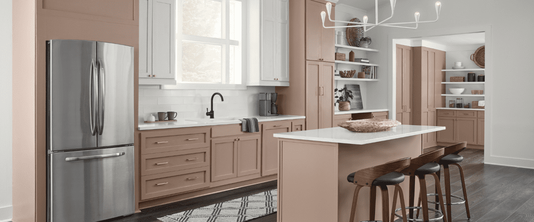
We may still may be a few months away from 2023, but Sherwin-Williams has already released its Color of the Year in preparation for the upcoming design season. “Redend Point”—a warm, pinky brown—took the top spot, and Sarah Cooper of Cabell Cooper Design has a few ideas about how to incorporate this trending shade into your home.
Cooper says this color’s popularity is likely a result of the shift from cooler, grayscale neutrals to warm shades that feel more inviting and soothing. The concepts of wellness and creating a space that feels like home have been on the minds of designers and homeowners in recent months, so a switch in paint tones from something stark and clean to a cozier brown is to be expected.
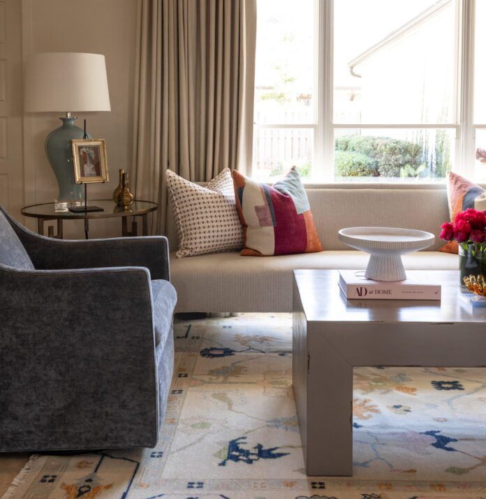
“It’s a warm, calming color infused with pink and dusty beige,” Cooper says. “It is an earthy, soulful tone that evokes connectivity and pairs well with beige neutrals and warm whites.”
Natural textures and materials are Cooper’s suggestion for pairing with Redend Point. Wood tones, for example, will draw on the color’s warmth.
“With its rich undertones, Redend Point works well with natural design accents, such as bamboo Roman shades, woven light fixtures and natural woven rugs,” she says.
This shade may be a bit darker than a lot of the more popular choices for wall color, but Cooper says it can work well in spaces that should be calming. Think family rooms, bedrooms and bathrooms. If you’re not ready to fully commit, however, it can also add a touch of welcome warmth in accents or cabinetry.
And with winter on the way, we can all use a little extra dose of coziness to see us through.


