
")
Designer tip: Rachel Cannon on the softer side of white
There’s a reason, says local interior designer Rachel Cannon, why the all-white kitchens remains a top design trend after so many years—it looks fresh, bright and welcoming. Its intimidating cleanliness, however, often keeps homeowners from taking advantage of its potential.
“We hear from our clients all the time that although they love the look of white, they think it will be difficult to maintain, from the counter tops, to the cabinets, to the fabrics,” Cannon says. “But it’s more attainable than you might think.”
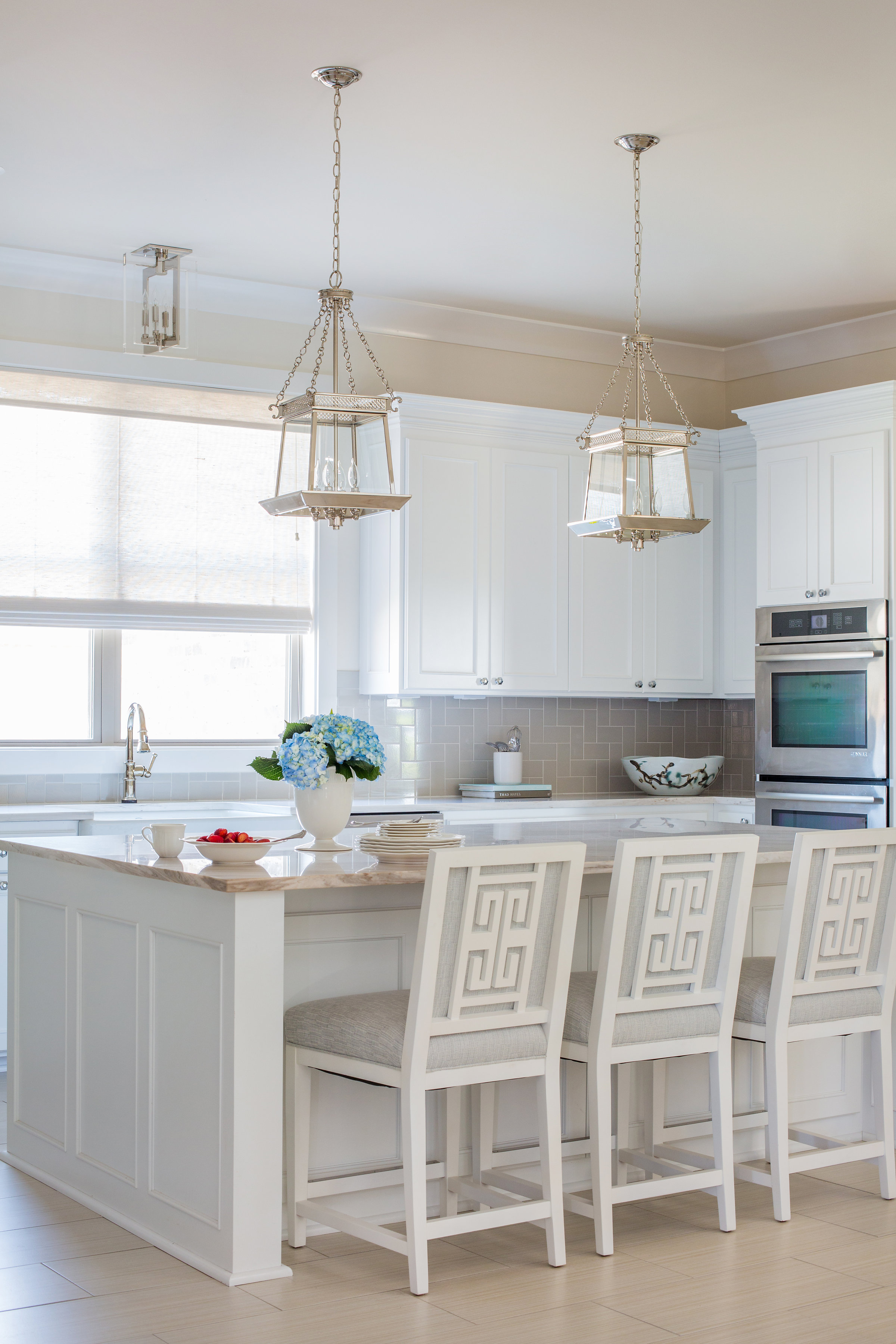 In the new-construction home pictured here, Cannon worked with her clients to select every finish, fixture and furnishing in the house.
“In the kitchen, we chose a marble countertop that has white as its base color, with taupes and creams swirling throughout,” she says. “It has the qualities people love about marble—veining, brightness and translucence—without the qualities that make a true white marble it a no-go: showing stains, scratching, and etching easily. This allowed us to work in a gray/taupe subway tile backsplash, perfect for people who love subway tile but are worried that white might look too stark or be too difficult to keep clean. The gray fabric on the barstools also adds contrast, while the white finish keeps things bright.”
But the good news doesn’t stop there, she says.
“The fabric on the barstools is our latest favorite design trend: Crypton. We use this fabric technology almost exclusively now, because it is not a treatment on top of fabric, it is part of the fiber of the fabric. Spills roll off, and stains like ketchup, syrup, grease or sticky sweets come right out with dishwashing soap and warm water. I know because I spilled an entire canned soda on one of these the day we installed their furniture, and the only mess we cleaned up was on the floor, where it had all rolled off and puddled.”
Even wall color needs to be carefully considered to keep a white room looking fresh without looking boring.
“The walls here are painted a soft off-white to pull from the tones of the flooring and counter tops,” says Cannon. “That allows us to use white washable paint on the cabinetry. Because the cabinetry is the standout feature of the room, using white there helps the entire room read as white.”
In the end, she says, all it takes is a little thoughtfulness to create a white kitchen that is, in reality, not totally white. “To recap: One, find a countertop that is light, with other tones to help it be more livable,” she says. “Two, use a backsplash that will pull one of those tones out and set the stage for contrast with the cabinetry. Three, Crypton fabric is your new best friend. And four, paint the walls a shade other than white, and save the white for your cabinets, where it will really make an impact.”
To learn more about Cannon and her designs, visit rachelcannonlimited.com. And check out another of Cannon’s recent home design projects in this story from the March issue of inRegister, available on newsstands now.


