

Pink is trending. Here’s why the color belongs in your home
The Barbie movie has reinvigorated our deep love for pink, but there were definitely others fueling the fire prior to its release. Remember the iconic Valentino Parish Fashion Week back in 2022? Let us jog your memory. The bold fall/winter ready-to-wear collection straight from the imagination of creative director Pierpaolo Piccioli painted the place pink. Monochromatic and oh-so-bright, the looks were stunning, of course, but what really caught our attention was the transformation of Paris’ Carreau du Temple with the same bright fuchsia covering nearly every surface.
“Pink is a form of freedom that exists maybe nowhere else in the realm of color,” the fashion house wrote on Instagram. “Pink is a manifestation of the unconscious and a liberation from the need for realism.”
View this post on Instagram
We could all use an escape from reality—even if we can’t afford those iconic platforms (you know the ones). So we can’t pass up the opportunity to get in on this trend. But just like Valentino, we’re pushing the envelope. Anyone can wear a hot pink dress. We’re bringing the trend into our homes instead.
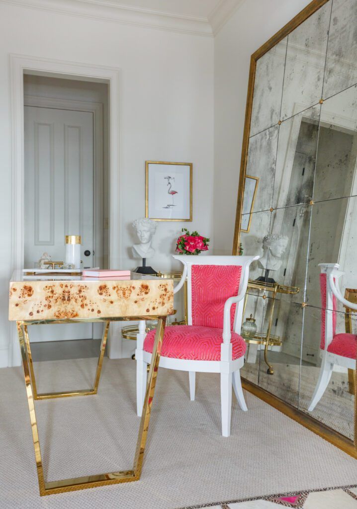
“This is one of my favorite colors,” says designer Rachel Cannon of Rachel Cannon Limited Interiors. “I love the idea of taking a huge risk and going very bold with color, then pushing against the idea that only a pop will have an impact. More is more in this case!”
According to Cannon, fuchsia can become a neutral if you use enough of it. And she is deeply against the idea that any shade is inherently “too much” for a refined, mature space.
“The misunderstanding that bright colors are not sophisticated just isn’t true. They’re more difficult to get right, unlike the muddy color we’re used to seeing in furnishings, but if you study the history of color, the deeper and more vibrant they were, the harder they were to produce and thus, much more expensive,” Cannon explains, adding that any color connoisseur should check out the book The Secret Lives of Color by Kassia St. Clair. “Incorporate a color because you love it, and don’t worry if others will find it unsophisticated.”
With this advice, Cannon urges that color isn’t something to be afraid of. Rather, if a shade speaks to you, then you don’t need to worry about it becoming obsolete or “so last season.”
“If standing the test of time is what you’re looking for in your interiors (and who isn’t?), then narrowly focus on your secret obsessions and find ways to bring them into your space,” she says. “If you’re still timid about it, you can always punch up an all-white or all-neutral space with fine art works in your bold shade of choice. It’s important to allow some level of indulgence when considering a color like this.”
You don’t have to tell us twice.
For more from Cannon, check out this home featured in our February cover story, or head to rachelcannonlimited.com.


