


A punchy, pattern-rich palette inspires a Pollard Estates home’s happily ever after
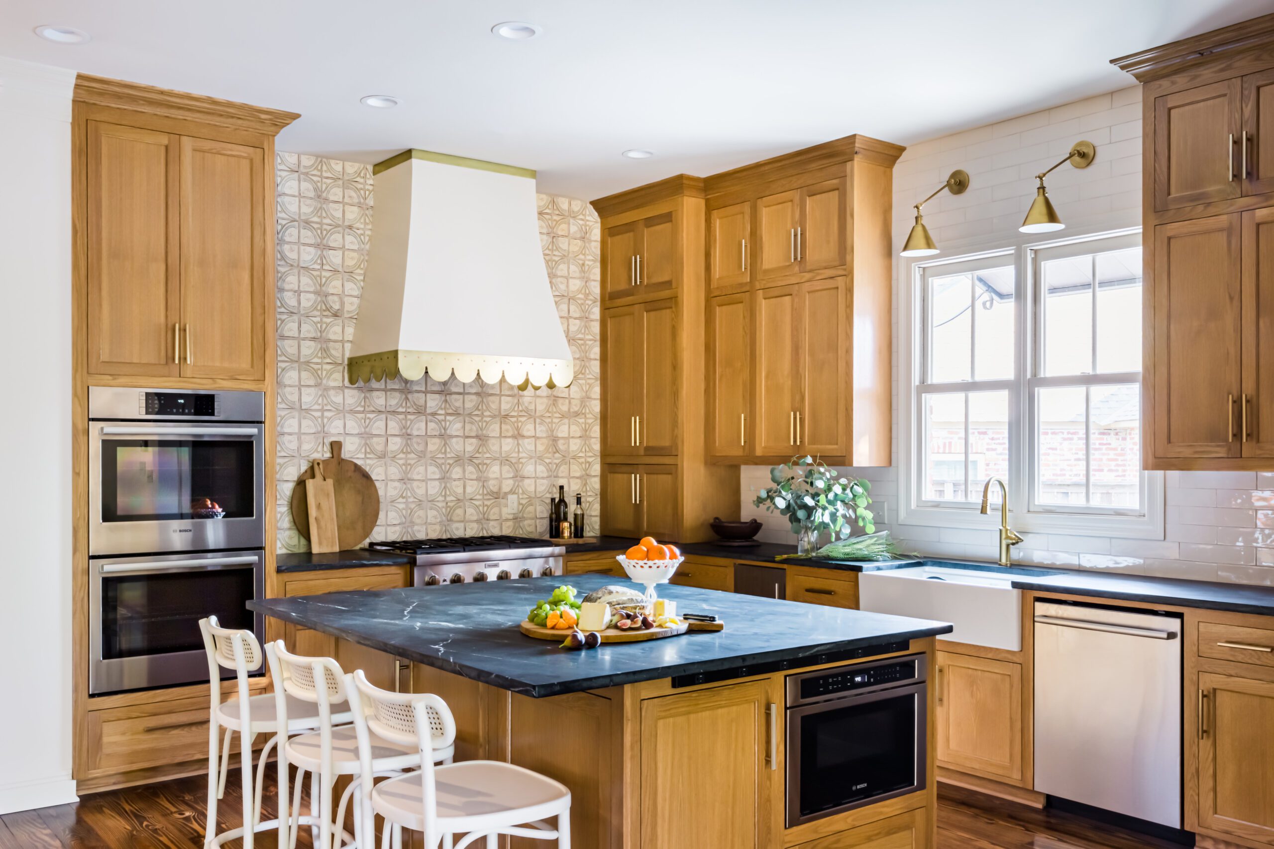
“The thing that irritated me most about my house was my dark kitchen countertops,” confesses Carmen Lavergne.
Though the goldish-brown granite wasn’t the main motivating factor behind Carmen and her husband David’s home renovation, it definitely was a side benefit to know that she would be cooking in a light and bright kitchen when all the dust eventually settled.
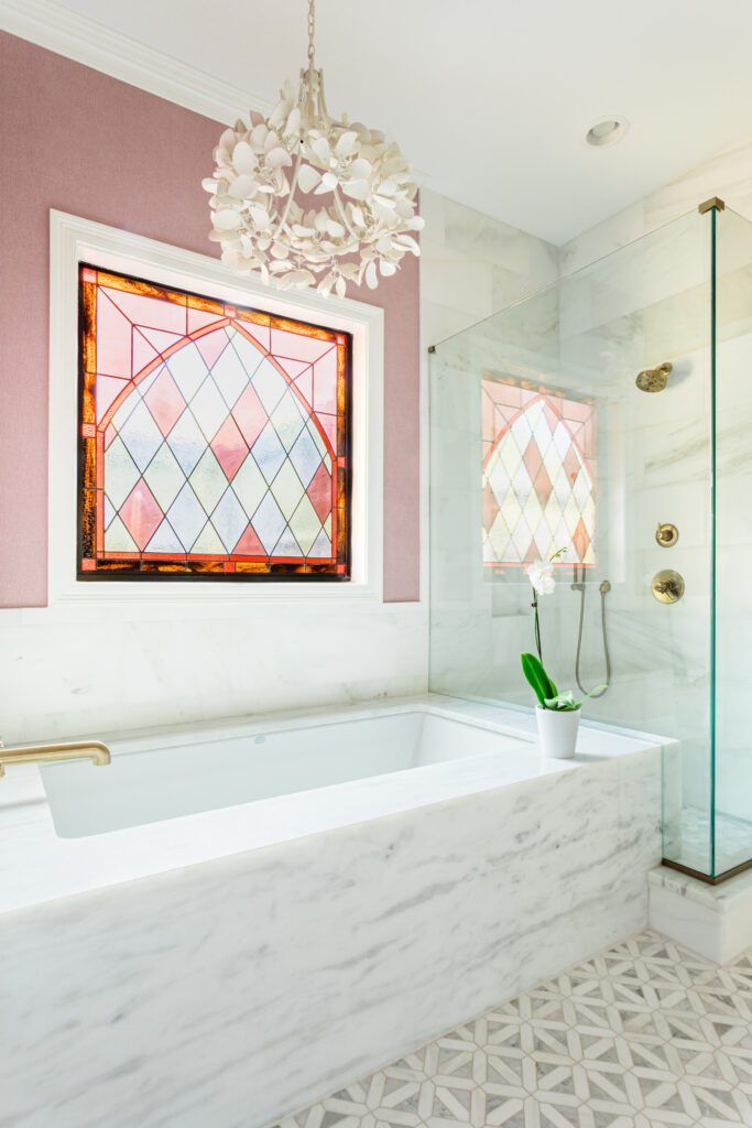
Fast-forward to the project’s completion, when Carmen prepped for her first family meal in the new kitchen on, wait for it, even darker countertops. Black soapstone, to be precise.
And she couldn’t have been happier about it.
“It’s really funny,” she reflects. “But I love them. Somehow the room still feels so bright and the countertops sort of recede into the background.”
The unlikely choice for the new space came as a result of the counsel of interior decorator Anne Underwood of Underwood Interiors. The Lavergnes had called upon Anne to infuse their home in the Pollard Estates neighborhood with equal doses of personality and practicality after living there for more than a decade.
When Carmen and David first purchased their house in 2007, it was already under construction, leaving them with limited choices when it came to architectural details and décor. “We tried to make it our own with colors and paint, but it never really felt like anything special or unique to us,” Carmen recalls.
But after several years of inhabiting these rooms, they decided it was time to make some major moves.
“When we started the renovation, our son Hayes was in ninth grade and our daughter Camille was in eighth grade,” Carmen says. “We wanted to make the house more livable for us and more functional for their high school years.”
Enter Anne, who embraced Carmen’s call for a more lively look in a big way. “I had never used an interior decorator before because I love decorating and home interiors,” says Carmen, who first worked with Anne to select exterior paint colors a few years prior. “But I felt that Anne had more of an artist’s eye, which I needed because I had some ideas that I thought might be too out of the box.”
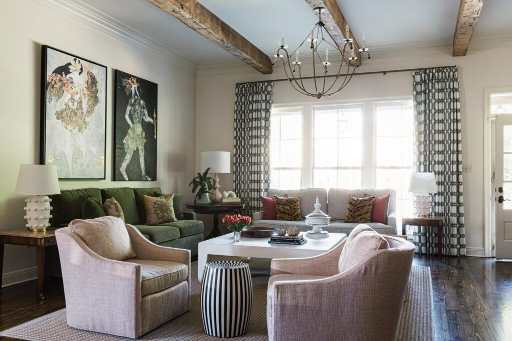
The couple and their team, also including Cameron Moore Construction, toyed around with some major structural changes but eventually settled on smart transformations that made the most of the existing space. One big adjustment in the open living area was the removal of a dual-sided fireplace that “sort of divided our kitchen and keeping area from our den,” Carmen says. “That was something Anne really insisted on, and at first I fought tooth and nail to keep it because I didn’t like the idea of an open floor plan. But in the end, everyone who walks into the house says taking that out makes such a big difference, because that fireplace really broke up the flow of the room. So I was glad I trusted her opinion.”
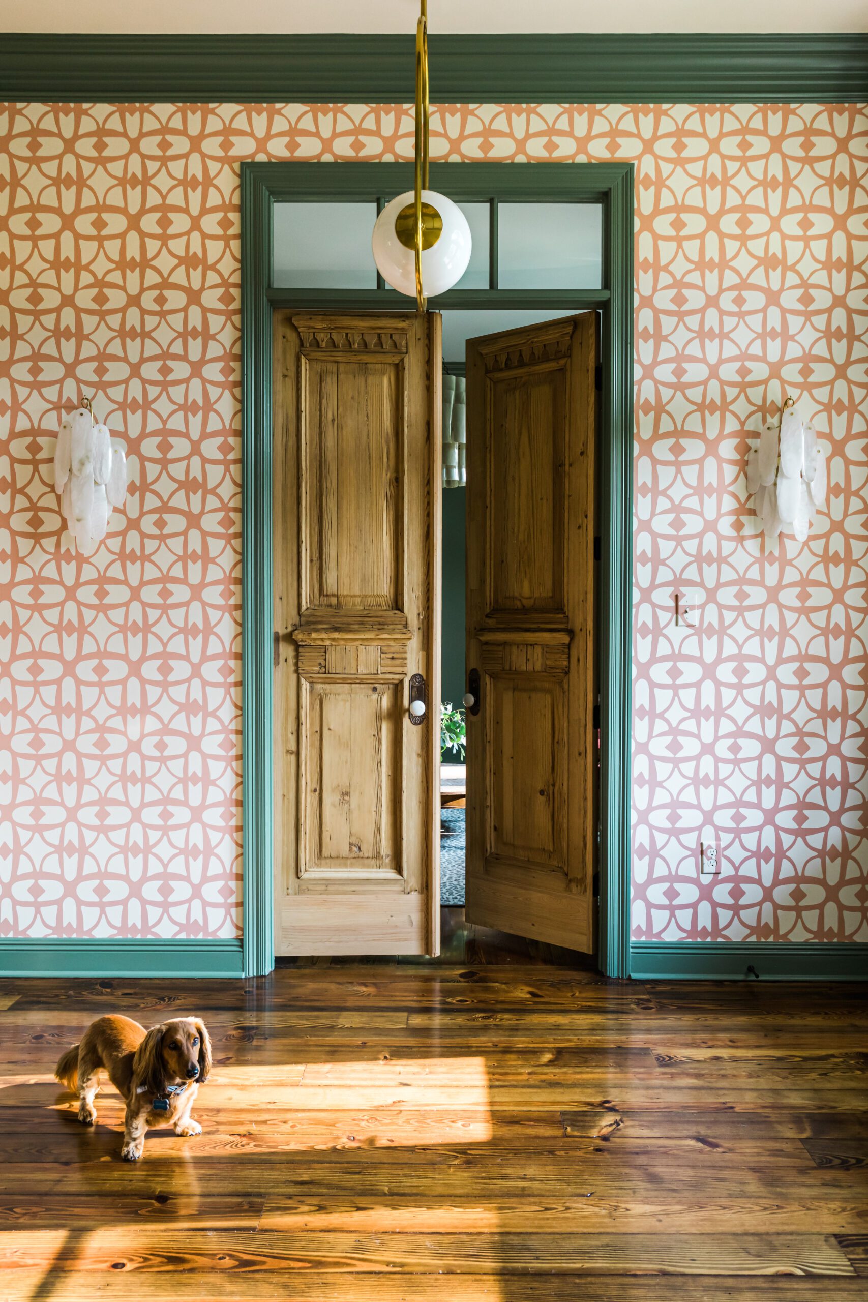
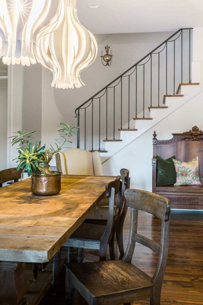
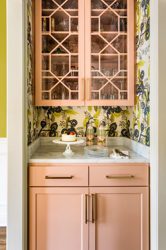
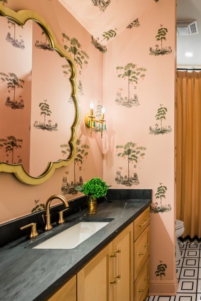
Anne never balked at Carmen’s desire to push the décor past the typical neutral palette into something more lively and energetic. And that energy starts the moment guests walk through the front door into a foyer framed by earthy-pink patterned wallpaper paired with a deep green paint color on the trim. Combined with a chartreuse shade on the dining room walls just off this entryway, it was a mix that even Carmen felt nervous about—for just a moment. “When I saw it all together, I was worried that it was too much,” she admits. “But Anne said it would be fine. And it’s better than fine—it’s great.”
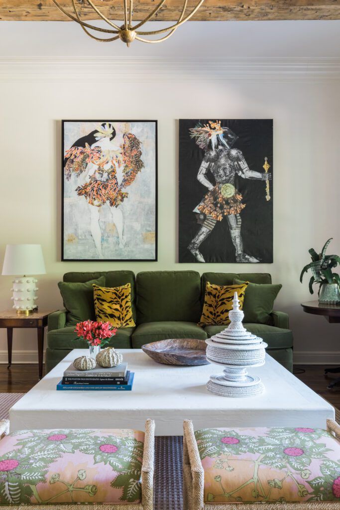
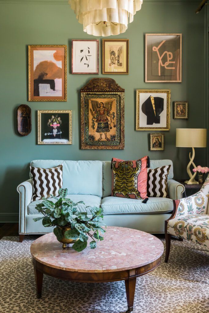
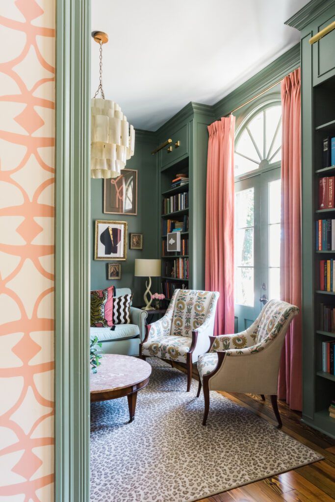
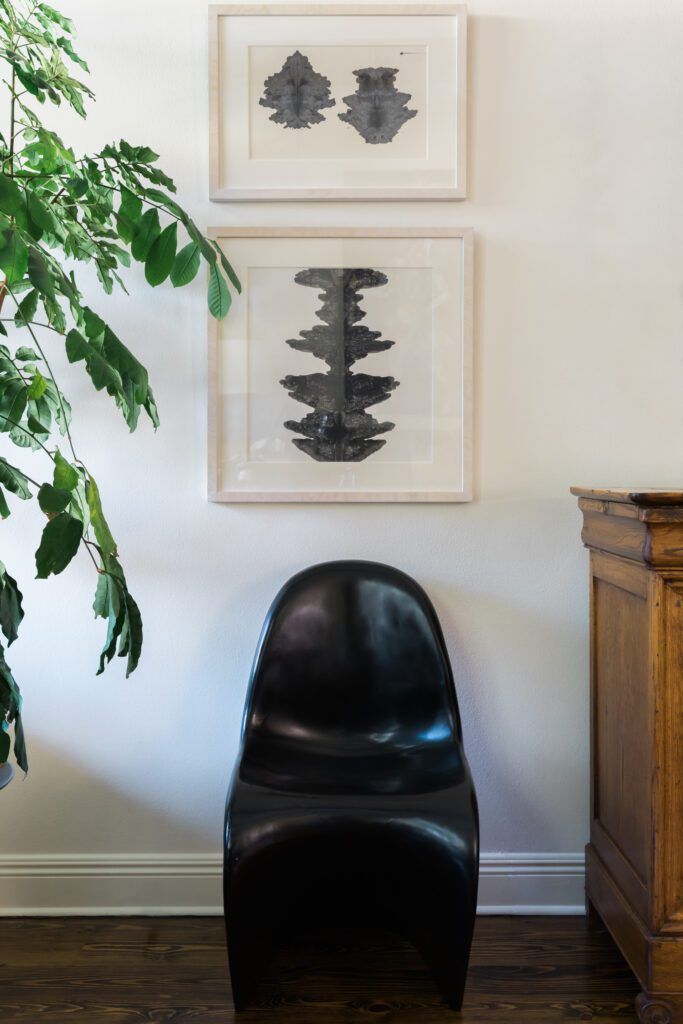
In fact, the green trim serves as a grounding force against the boldly patterned pink paper, and as a prelude to the matching green walls in the study that now takes the place of a former guest bedroom just across the foyer from the dining room. Here, Anne added built-in bookshelves and set the scene with heirloom furnishings including a pair of armchairs recovered in a fresh floral pattern. The pink marble-top coffee table was once in David’s grandmother’s house, along with a pair of end tables that now perch in the living area. Anne created a salon wall above the study’s sofa using some of the family’s favorite artworks along with new pieces by Tracey Mose and Lindsey Porter. “I love the way this room evokes a feeling,” Anne says. “It’s a good mix of old and new.”
The kitchen—previously home to those annoying dark countertops—was the location of another major makeover. New white oak cabinets extend to the ceiling, a detail that Carmen says was a must-have and provides “tons of extra storage—even if we have to climb up on a ladder to get to it.” The wall above the stove became a focal point with a brass-trimmed hood and tile backsplash in a custom colorway. “And that’s how we ended up with black countertops,” Carmen explains. “We fell in love with that tile, but when you put white stone up against it, it just kind of washed it out. It needed the darker black to complement it.”
As she worked her magic in each room of the house, Anne kept Carmen’s requested palette of joyful hues in mind, even adding an extra dimension by painting ceilings in a pale sky blue. “We really thought about how all of these spaces would layer upon one another,” Anne says. “So we wanted to use color, but color that would complement the other rooms. We threaded the pink and green throughout the rest of the house—not necessarily matching everything but giving a nod to what you see in the other spaces.”
Those whimsical patterns and playful colors now serve as the backdrop for a busy family—one that would pick this same palette all over again. “I think it’s not for everybody, but that’s kind of what I wanted,” Carmen says. “It’s fun, and it makes me happy.”


