How to use Pantone’s Color of the Year in your home
Since the turn of the new millennium, Pantone has named one of its thousands of colors as Color of the Year—the perfect orange, green, pink or any hue in between whose energy mirrors the predicted vibes of the coming months. In the past, the chosen colors—whether “Tangerine Tango” or “Rose Quartz and Serenity”—have come straight from the company’s collection, but 2022’s introduction of “Very Peri” marks the first time a color has been mixed especially for the honor.
Described by Pantone as a “red violet infused blue hue,” the color nods toward the blending of the cool and the creative, helping in 2022 to “embrace this altered landscape of possibilities, opening us up to a new vision as we rewrite our lives.”
This rings especially true for artist and owner of Artvark, Claire Major, who constantly finds new inspiration in the vintage artworks that inspire her modern take on interior design, and who recognizes similar shades of the color in some of her favorite existing pieces.
View this post on Instagram
“Periwinkle has always been my favorite of the blues,” says Major, “though when I first looked at it, I saw a bit more purple. It changes depending on how you look at it.”
The color does indeed include red undertones, she says, but that doesn’t compromise the hue’s overall calming effect.
“Still, I wouldn’t necessarily paint a whole room this color since it would appear so bright,” Major says, “but I think the color would be complemented by blacks or charcoals in things like pottery, or complementary colors like an olive green—tones that would help equalize a space.”
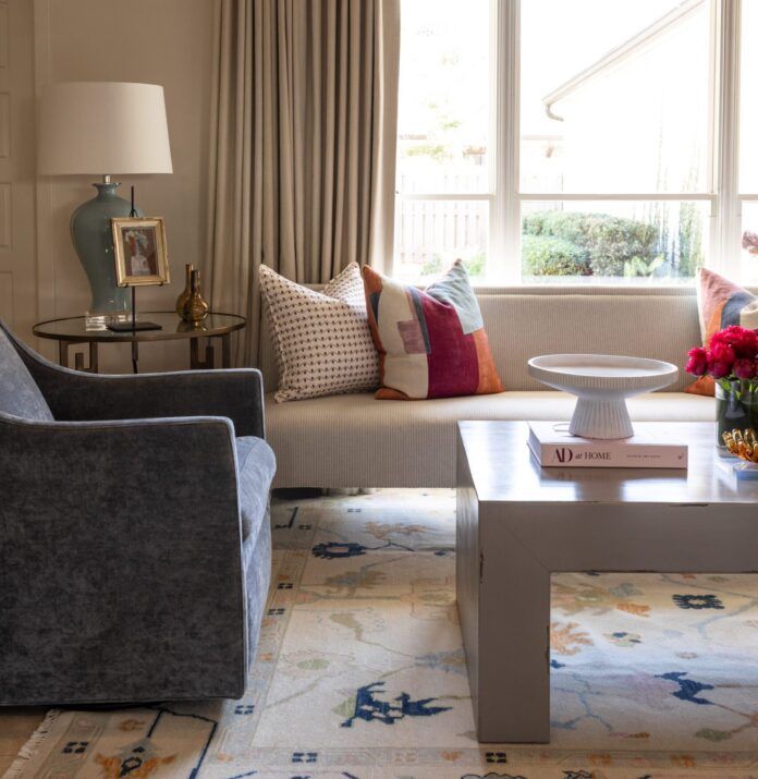
Natural textures in soft, neutral colors would also encourage the color to soften up a room, she says, and would work well when paired with light—almost white—wood floors and light-colored, woodsy straw baskets. However, the color would also be an interesting choice for the sheen of a velvet sofa or chair, Major adds, or as a trim or subtle detail in pillows, curtain trims, drapes and rugs.
“The more I look at it, the more I like it,” says Major. “Its tone changes depending on how you think about it—if you think blue you see blue and if you think purple you see purple—and what you pair with it. I’m sure that was one of Pantone’s intentions.”


