


Paint color trends to look out for in 2022
What’s the old adage about how watching paint dry is boring? Well, we disagree! There’s nothing more exciting than watching a space be transformed, and there’s no easier way to bring about that transformation than through paint.
But before you run out and pick up a can of white, we’re delving into the paint color trends that will be all the rage in the coming new year with the help of local designer Aimee Walker. Let’s all welcome in the new year with a #newyearnewpaint mantra, because why not?
“Spa,” Benjamin Moore
Green kitchens have risen in popularity since Dakota Johnson’s verdant cabinets and bowl of limes went viral in her Architectural Digest home tour, a showcase of her midcentury modern abode. Here is a green shade that is sure to be Johnson-approved.
This green is a little more muted when compared to Johnson’s green, but “‘Spa’ is a richer color that brings the color of nature into any space,” says Walker.

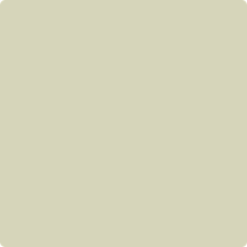
“Evergreen Fog,” Sherwin-Williams
Sherwin-Williams’ 2022 color of the year is another green: “Evergreen Fog.” As pictured in the featured image at the top of this article, this subtle and smooth green is a suitable pick for freshening up any space.
“If you look to all the official paint companies, you’ll notice the trend toward green, and often softer kinds of gray-greens,” notes Walker. “I think the reason for that is COVID, when everyone was stuck in their homes and not going out much.”

“Citrine,” Benjamin Moore
“Instead of everything being white-on-white, people are choosing statement colors for focal areas, whether it be with the furniture, the wall color in an area of backsplash or an island, and definitely with artwork,” says Walker.
There is nothing more regal than gold, right? That’s why this statement shade is a favorite of Walker. She advises using splashes of this in lieu of typical white to create an impact and infuse a space with personality.

Iron Ore, Sherwin-Williams
While the theme of the previous picks in this lineup has been bringing the outdoors in, Sherwin-Williams’ “Iron Ore” is a favorite of Walker because of its ability to work well on a home’s exterior and interior. The deep shade creates attention-grabbing curb appeal, but can also be utilized inside to establish a moody tone in a room.

“Light Pewter,” Benjamin Moore
If you aren’t ready to cover your walls in “Citrine,” Walker suggests opting for a neutral that is a more interesting alternative to plain white. “Light Pewter” is a good base color that allows for plenty of colorful accessorizing, which Walker says is essential for creating a successful space.
“The most important thing is to add texture, and not rely on smooth surfaces everywhere,” she notes. “You have to add some texture to add some interest.”
Which color is your favorite? Let us know in the comments below, or by tagging us on Instagram or Facebook.


