


Designer tip: Rachel Cannon Lewis on complementary color schemes
According to Rachel Cannon Lewis, owner of Rachel Cannon Lewis Interiors, interior designers get asked about color more than any other design element. Clients may be interested in using color, she says, but often get cold feet when it comes to committing, whether with paint selections or even fabrics.
After all, she says, anyone who has ever flipped through a home magazine has probably swooned over rooms saturated in color and pattern and wondered how in the world they would ever start to create a look like that in an ordinary home.
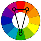
 “It might surprise you,” says Lewis, “that many designers create interesting, unexpected color schemes by going back to basics. I’m talking about the color wheel! The last time you looked at one was probably elementary school, but designers are intuitively aware of not just color values, but undertones, complements and saturation levels.”
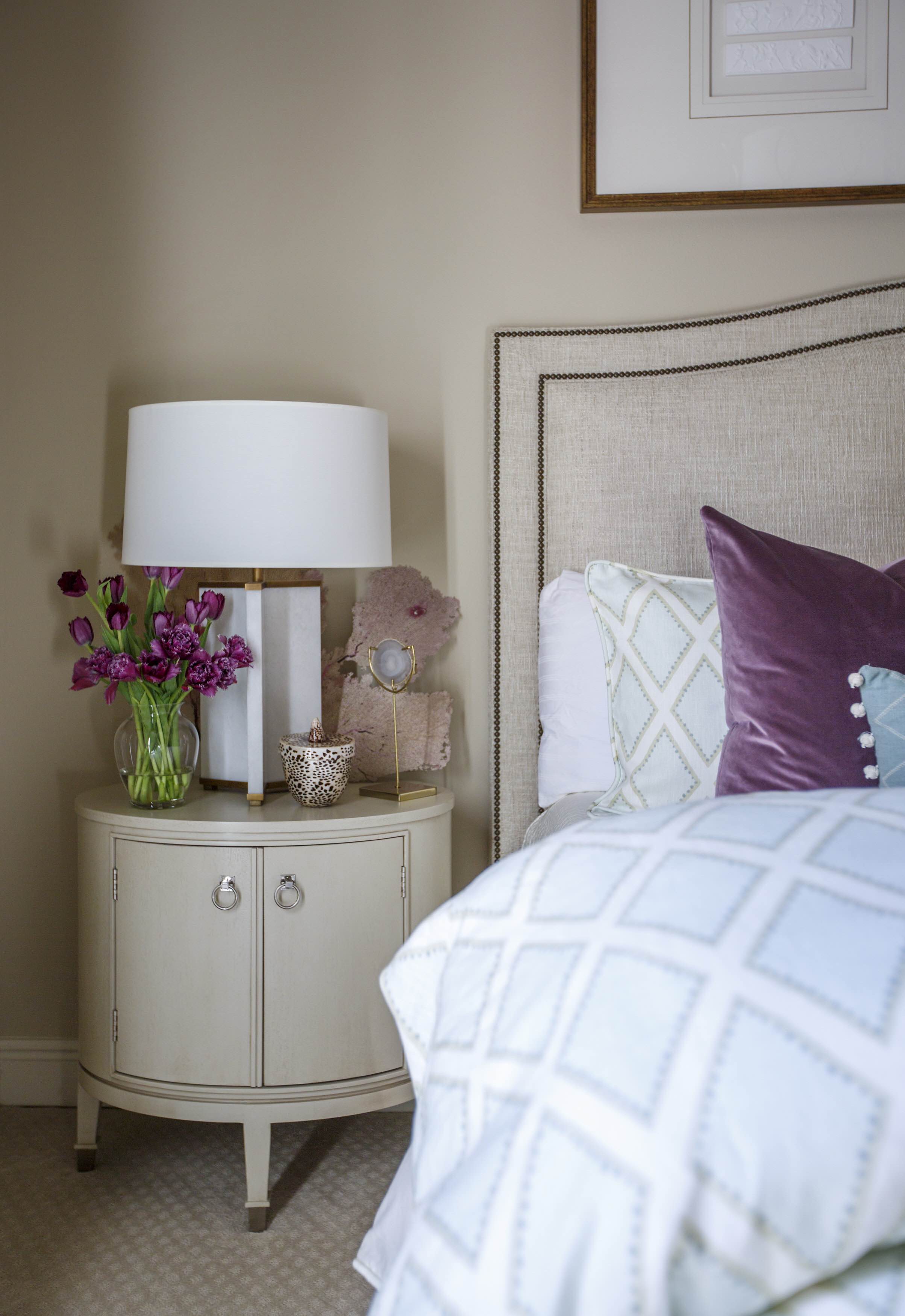
Lewis points to a bedroom she designed as an example. “In this guest room we helped our client complete, we worked with her existing warm base of wall color (with a peach undertone, and you’ll see why that’s important in a minute), upholstered headboard and casegoods,” she says. “She already had drapes custom-made in a gray-green-blue linen, so we had to commit to using that color in the room. We chose bedding that incorporated both lighter and darker shades of the drapery color, but the room still lacked depth and interest.”
Here’s when Lewis breaks out the color wheel.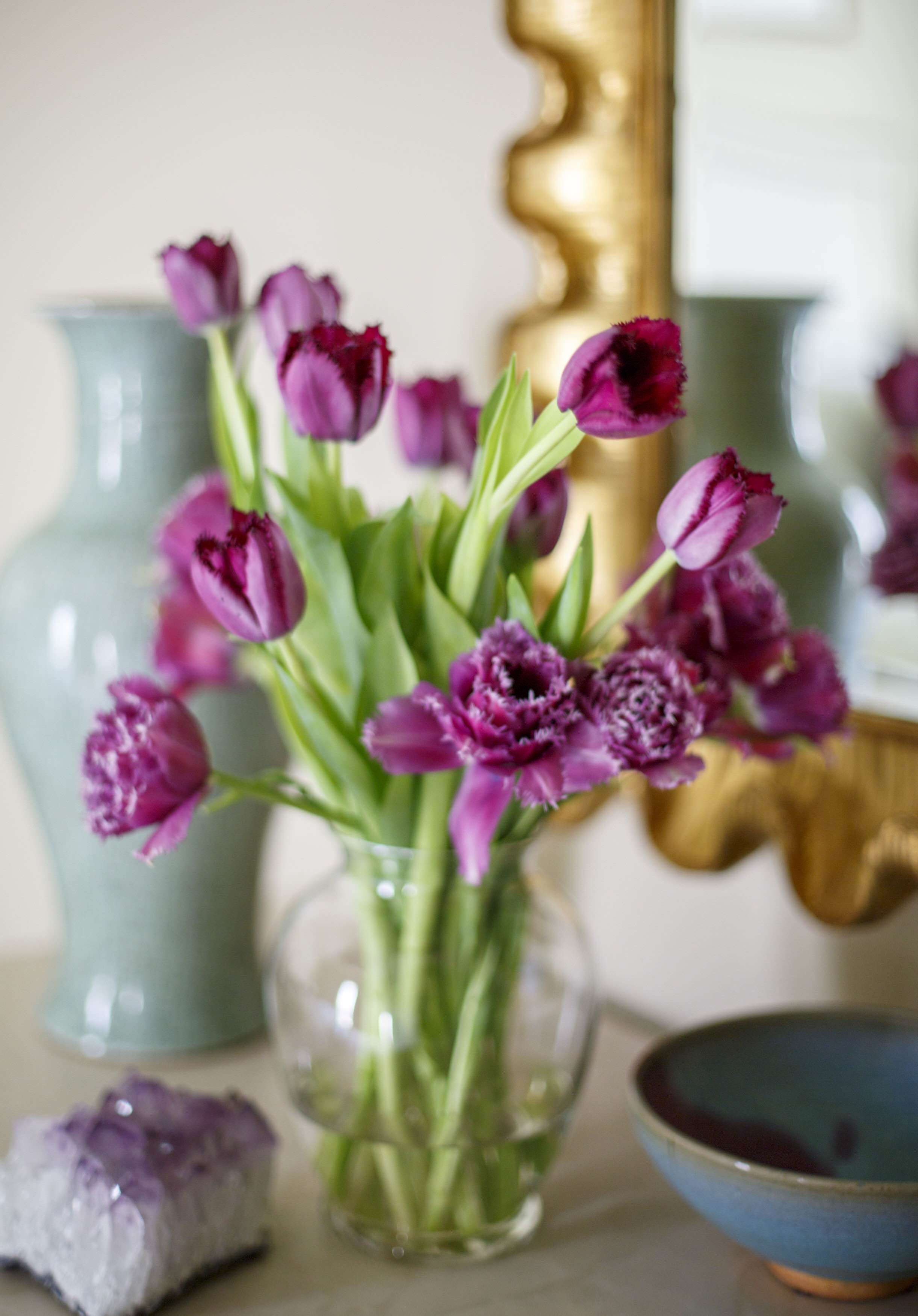 If you remember the basics,” she says, “each color has a complementary color (red/green, blue/orange, yellow/purple), and those colors intensify each other when used together. So we used what is called a split complementary color scheme in this room to create something unexpected.”
Just what is a split complementary color scheme? “On the color wheel, complementary colors are directly across from each other,” Lewis explains. “But if you were to move one to the right and one to the left of the complementary color, you’d create a split complementary color scheme. Green’s natural complement is red. To the left of red is purple, and to the right is orange. In our equation, our gray-green-blue drapes act as our green base color. Our plum accessories and pillows act as the purple part of the triad; and the wall color, which has a peach undertone, acts as the orange, completing the dynamic between the three colors.”
 If all that still sounds a bit confusing, don’t worry. Not every room is composed solely of primary and secondary colors, after all.
“It’s the concept that drives the color palette forward into something beyond beige,” says Lewis. “Don’t settle for all neutral if what you love is color! This simple tool will unlock a world of designers’ secrets to you.”
To learn more about Lewis’ designs, visit rachelcannonlewis.com. And check out more tips on ready-to-roll color palettes in Lewis’ article in the October issue of inRegister, available on newsstands now.


