

Is chartreuse the true color of the year?
Pantone’s choice for Color of the Year left some in an uproar. “White is not a color,” many wrote online after hearing the news of “Cloud Dancer” being chosen. (For a more positive take on this color choice, read this story from our archives.)
Pushing their disappointment aside, trend forecasters and interior designers alike are taking to social media and Substack to share their own chosen colors of the year, with many landing on chartreuse.
View this post on Instagram
From Krewe lining their sunglass cases with the iconic shade to Tory Burch employing it on dust bags, boxes and branding, important and influential designers are backing the hue for the long run. And, so are local interior designers. Keep scrolling to read local designers’ thoughts on chartreuses and examples of their work that highlights the shade.
Anne Underwood
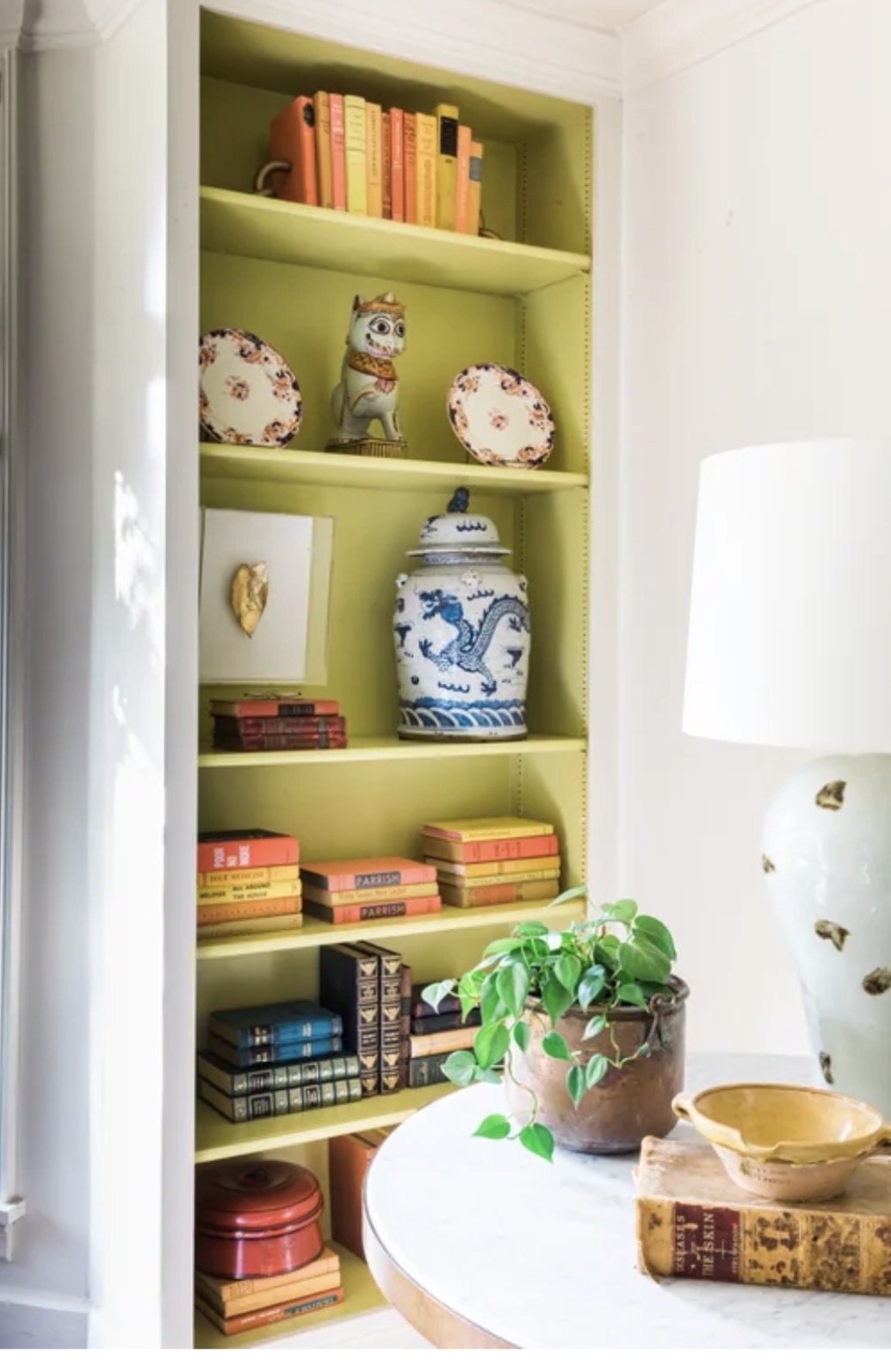
“Chartreuse is truly one of my favorite colors! I weave it into many rooms, from going bold with painted walls to incorporating smaller details of trims, lampshades, pillows and art. It creates joy by bringing life to a room and functions as a neutral because it works with every other color in any decorating scheme. If you feel like a room is dull or flat, add a bit of chartreuse to it and watch it come alive!”
Brinley Trent
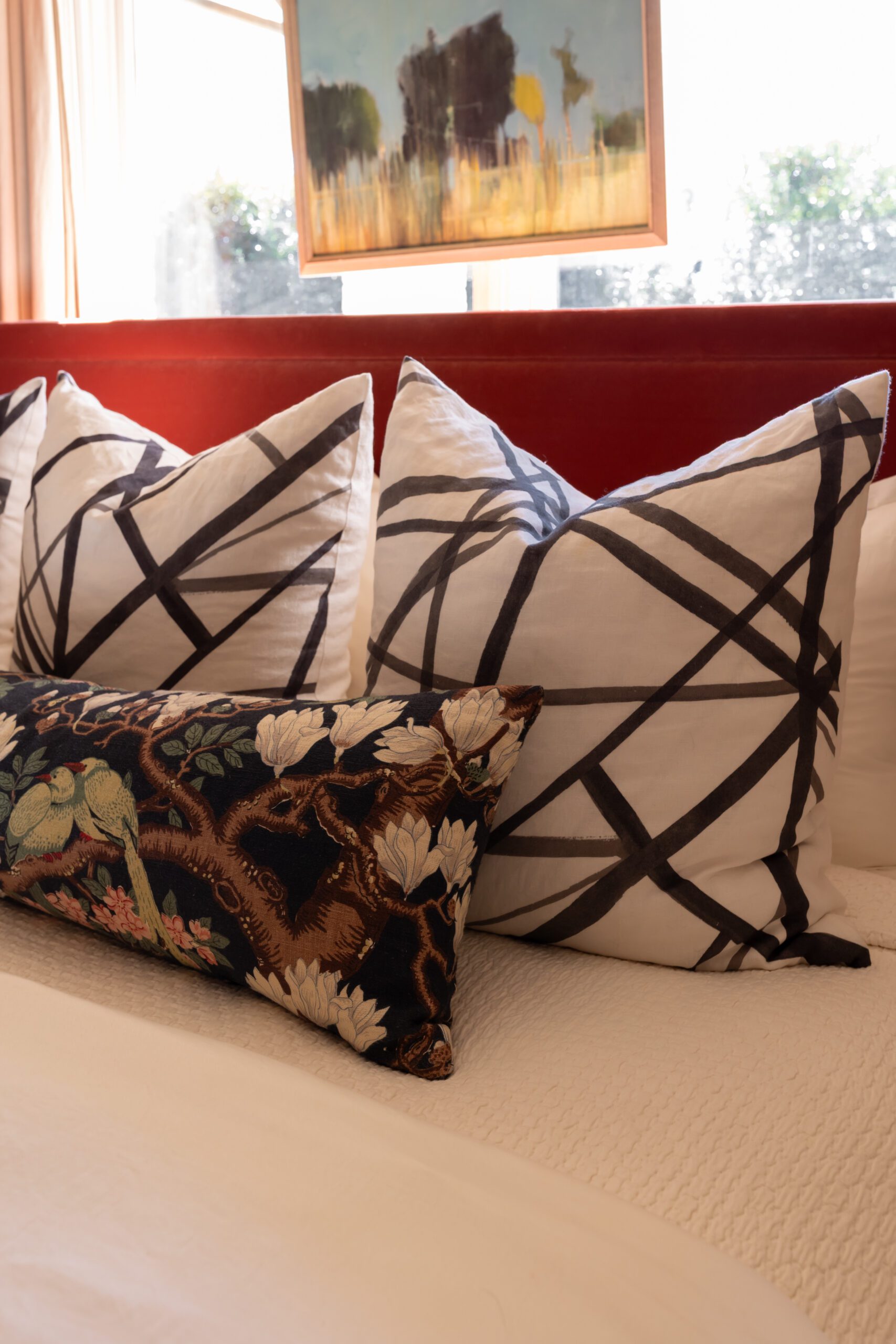
“I wholeheartedly agree that chartreuse is the true color of the year! It is a striking and beautiful shade. To add it to your home without it becoming overpowering, consider using it as an accent color—like in decorative pillows and artwork—or as a foundational element, such as a rug. You can definitely appreciate this vibrant color without allowing it to overpower the entire space.”
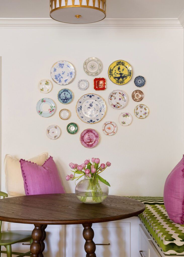
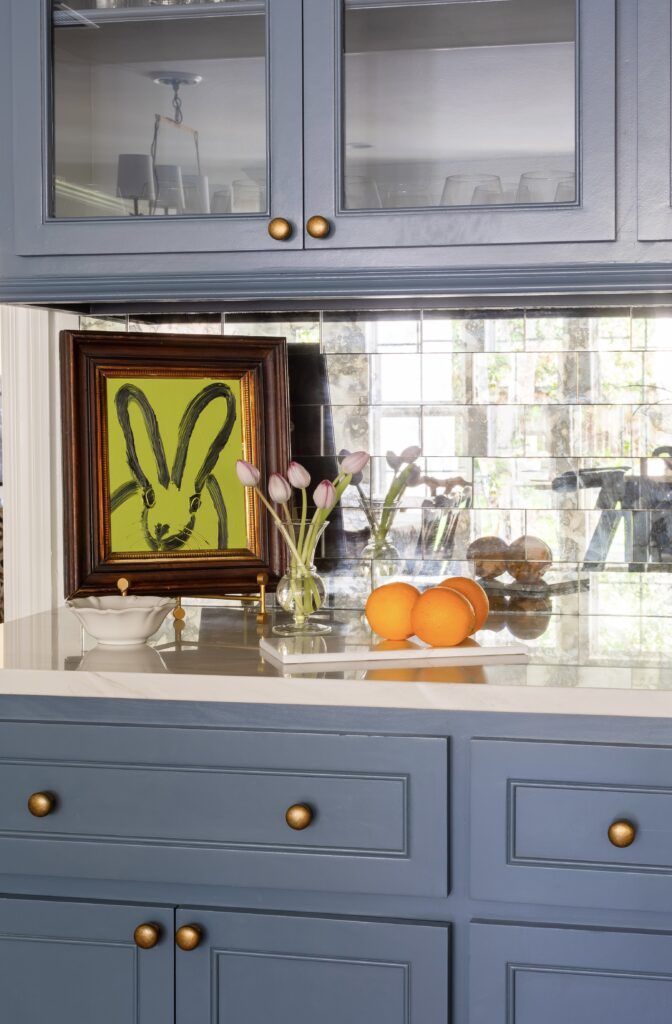
Ashlyn Elofson
“Chartreuse is a fun color to layer into a space because it feels fresh, playful and a little unexpected. I especially love pairing it with navy, as the depth of the blue grounds the vibrancy of the green. In these spaces, chartreuse shows up through art and accessories, adding energy and contrast against rich navy cabinetry. The result is a combination that feels bold yet timeless, balancing classic elegance with a fresh edge.”
Shane Griffin
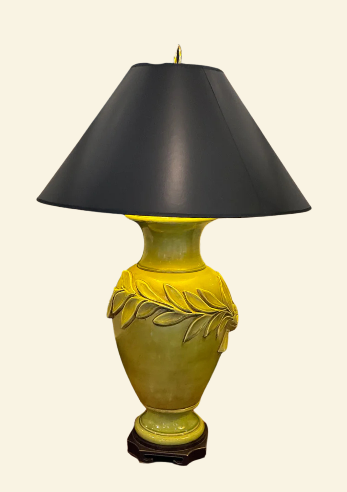
“I think chartreuse is the color of the year every year. I almost consider it a neutral!” Shop the lamp seen above here.


