

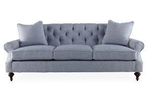
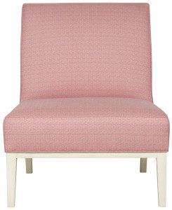
Color crush: A pastel palette for the home
Soft pastel color palettes are gaining traction in the fashion and home furnishings world. And if there was ever any doubt about it, Pantone’s announcement of its first-ever dual Colors of the Year put that argument to rest. Pantone, the world-renowned authority on color, selected Rose Quartz and Serenity—a pastel blue and pink—as 2016’s hottest hues. The colors represent society’s innate craving for calm and relaxation.
But that doesn’t mean that you need to paint your entire space blush and bashful. A few well-appointed pieces such as a table lamp, throw pillows or bookends can add a fresh spark to an otherwise colorless room. These hues are soft and soothing and create a sense of peacefulness much needed in today’s homes.
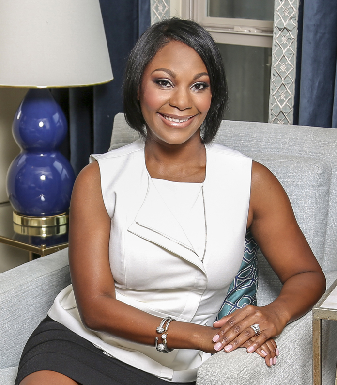 Arianne Bellizaire is an interior decorator, blogger, author and public speaker. She has been featured in Rue Daily, Good Housekeeping and USA Today, and she was designated as an official Style Spotter by High Point Market Authority in 2015.


